Guide
LWN Multi-Step Checkout
Styles & Colors
Table of contents
This section lets you fully customize the look and feel of your multi-step checkout. Adjust step styles, colors, loading animations, and more.
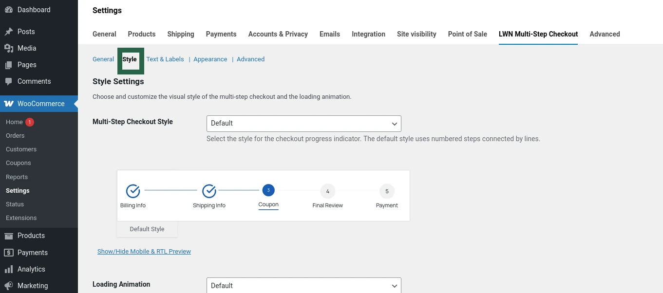
How to Customize Step Styles?
- Go to your WordPress dashboard.
- From the sidebar, navigate to WooCommerce > Settings > LWN Multi-Step Checkout.
- Click on the Style tab.
How to Customize Colors?
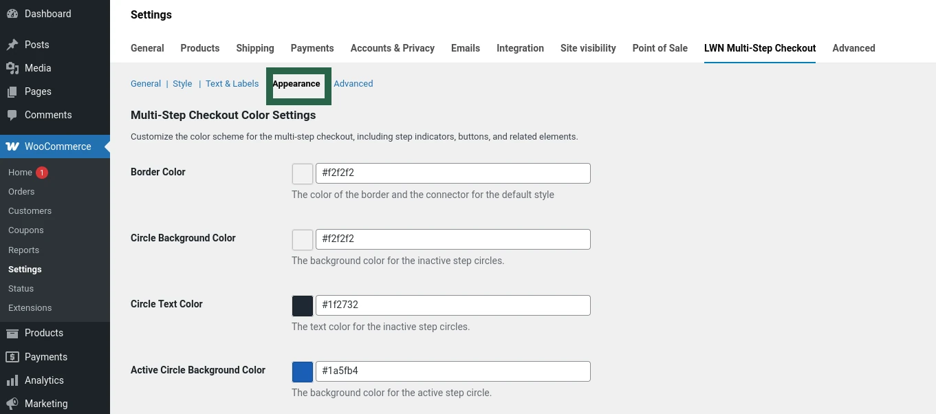
- Go to your WordPress dashboard.
- From the sidebar, navigate to WooCommerce > Settings > LWN Multi-Step Checkout.
- Click on the Appearance tab.
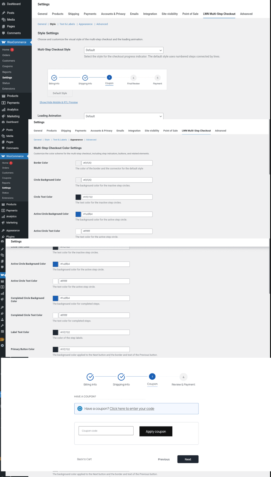
Default Multi-Step Style
The default multi-step checkout style features circular step indicators with numbers and a connecting line. You can fully customize the appearance:
- Border Color: Defines the color of the circle borders and the connector line.
- Circle Background Color: Background color for inactive steps.
- Circle Text Color: Text color inside inactive step circles.
- Active Circle Background Color: Background color for the current (active) step.
- Active Circle Text Color: Text color for the current (active) step.
- Completed Circle Background Color: Background color for steps that have been completed.
- Completed Circle Text Color: Text color for completed steps.
- Label Text Color: Color used for the step labels beneath or beside each circle.
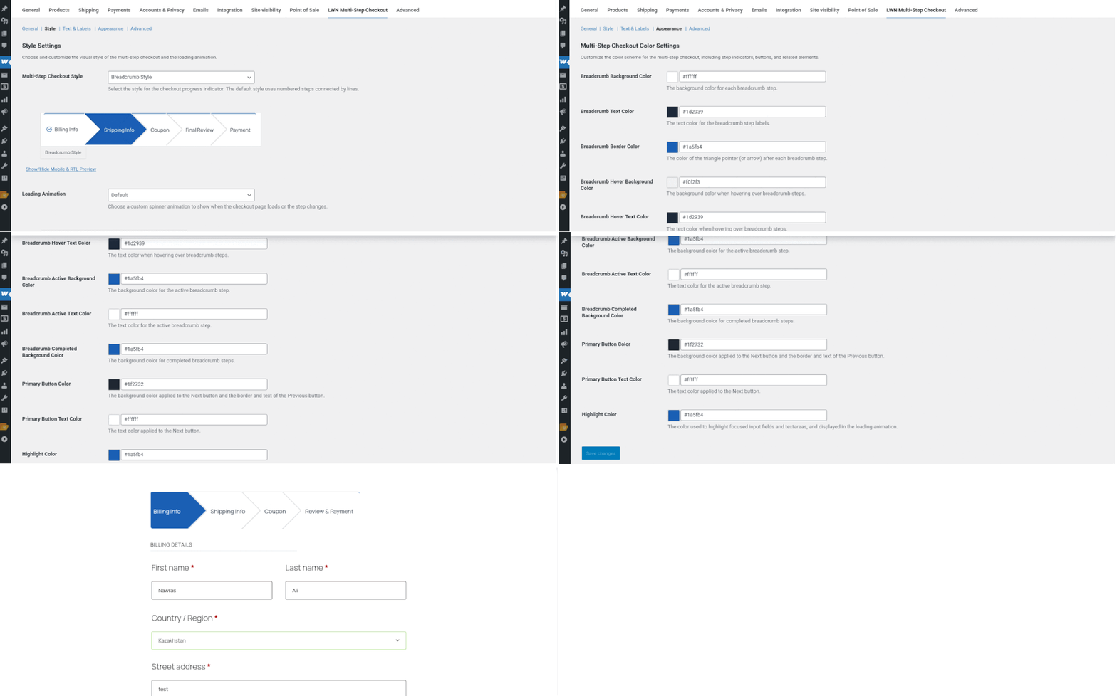
Breadcrumb Multi-Step Style
The Breadcrumb stepper style uses large, connected arrow-shaped steps to visually guide customers through the checkout.
- Breadcrumb Background Color: Default background color for each step.
- Breadcrumb Text Color: Text color for step labels.
- Breadcrumb Border Color: Color of the triangular pointer (arrow) following each step.
- Breadcrumb Hover Background Color: Background color when hovering over steps.
- Breadcrumb Hover Text Color: Text color on hover.
- Breadcrumb Active Background Color: Background color of the currently active step.
- Breadcrumb Active Text Color: Text color of the currently active step.
- Breadcrumb Completed Background Color: Background color for steps already completed.
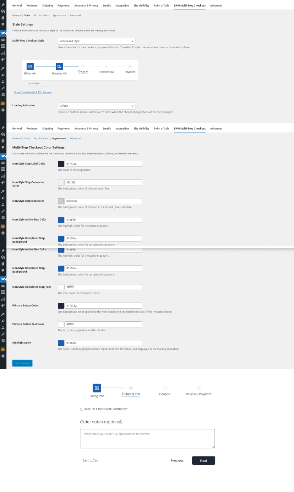
Icon Multi-Step Style
The Icon Style stepper builds on the default circle-based design by replacing step numbers with icons.
- Icon Style Step Label Color: Color of the step labels displayed below or beside the icons.
- Icon Style Step Connector Color: Color of the connector line linking the steps.
- Icon Style Step Icon Color: Background color of the inactive step icons.
- Icon Style Active Step Color: Highlight color for the currently active icon.
- Icon Style Completed Step Background: Background color for icons of completed steps.
- Icon Style Completed Step Text: Icon (or symbol) color for completed steps.
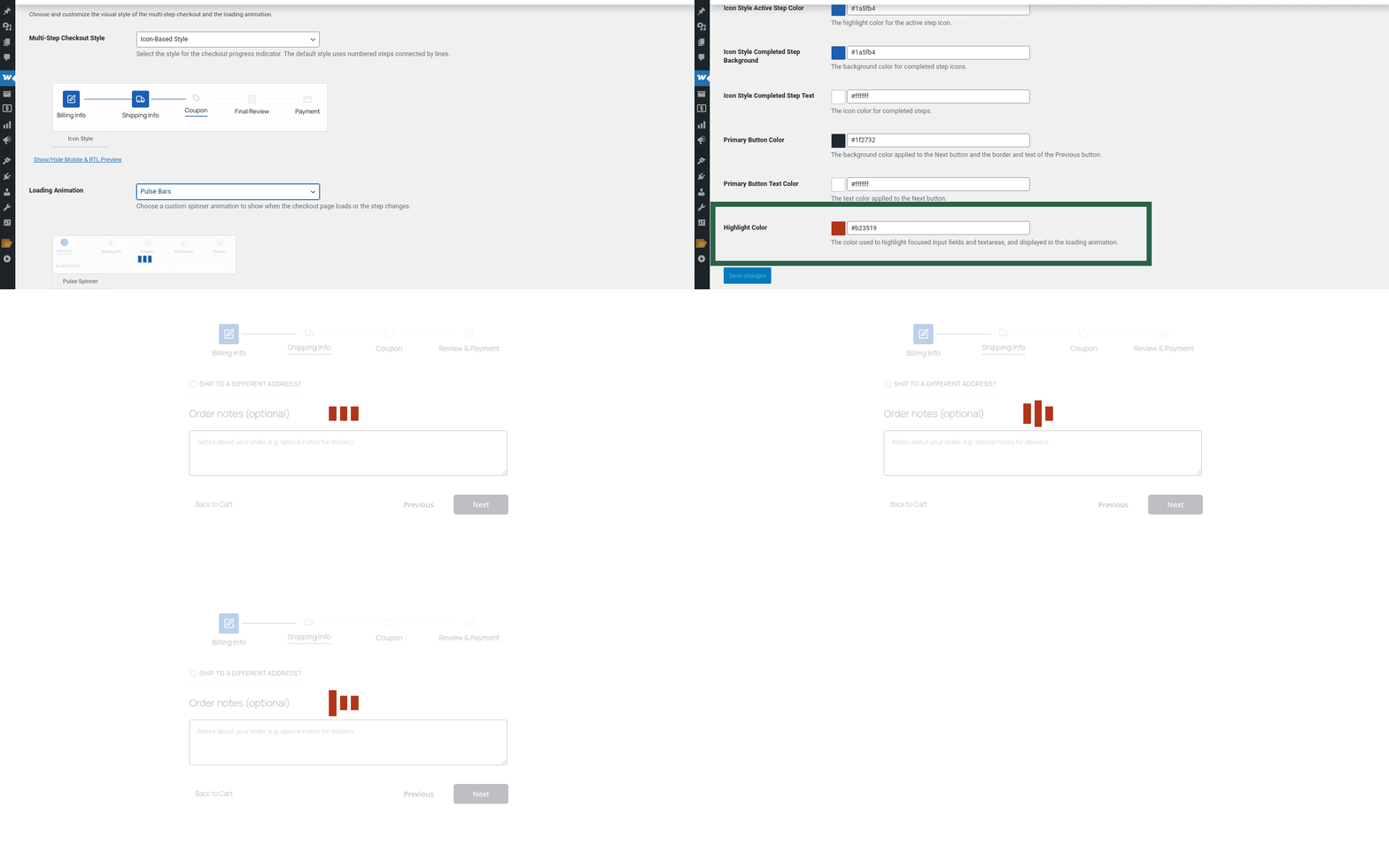
Loading Animation
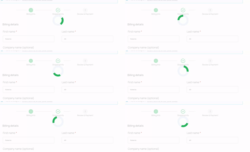
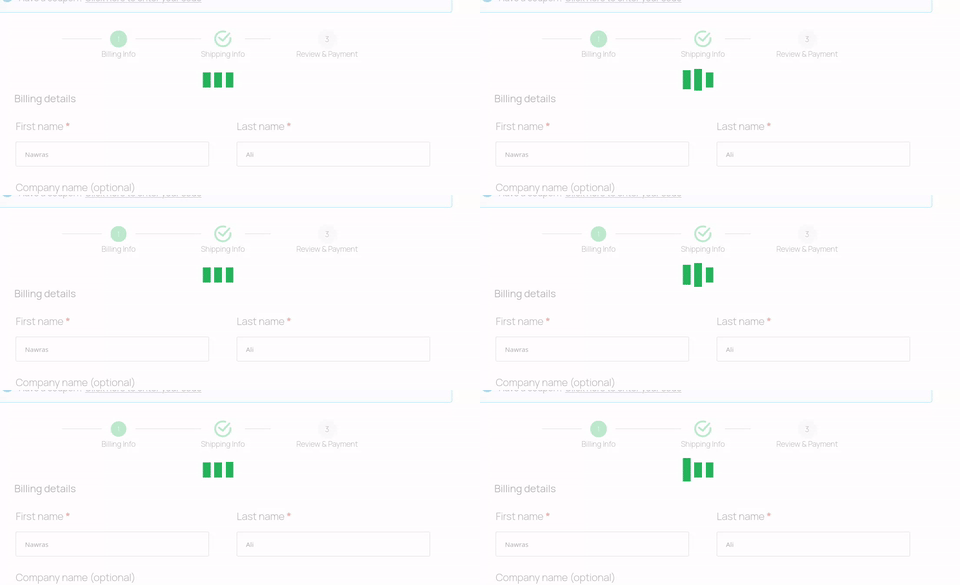
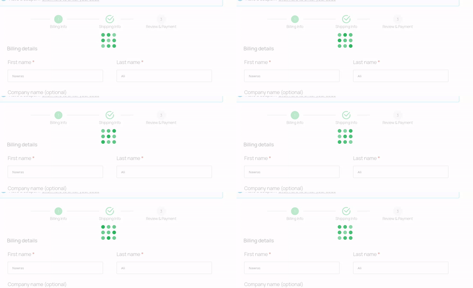
A loading animation is shown whenever a checkout step is processing — such as when saving form data or moving between steps.
- Spinning Circle (default)
- Pulse Bars
- Grid Dots
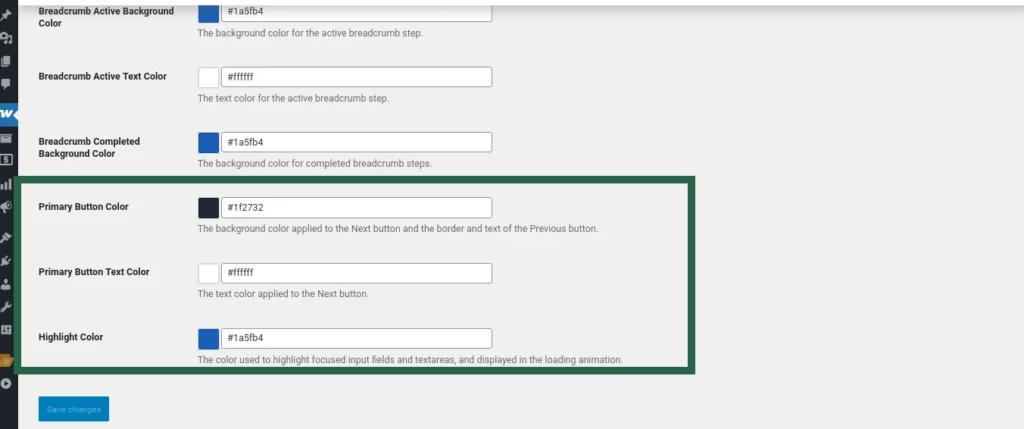
The color of the loading animation is controlled by the Highlight Color setting in the Colors tab.
Primary & Highlight Colors
These color settings let you customize the main interactive elements of the multi-step checkout.
- Highlight Color: Used to highlight active form fields (like focused inputs), and also determines the loading animation color.
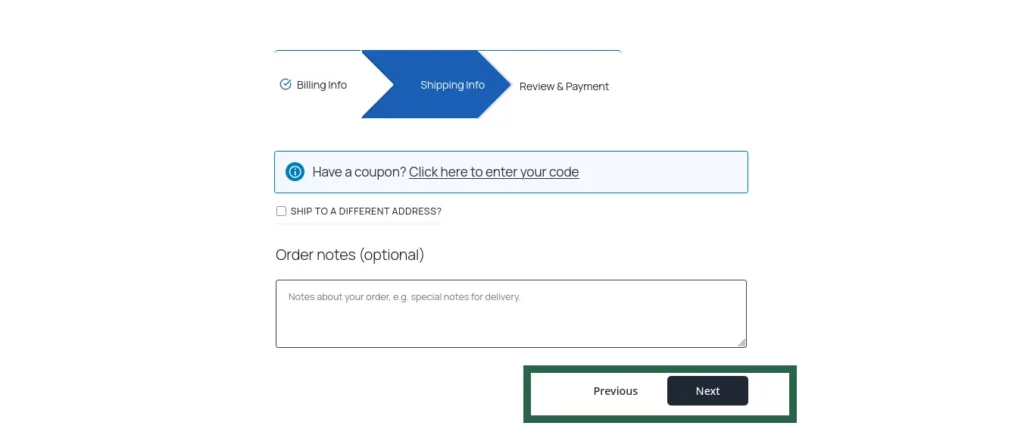
- Primary Button Color: Sets the background color of the Next button, and also applies to the border and text of the Previous button.
- Primary Button Text Color: Defines the text color used on the Next button.